


About
My name is Lauren
As the artist behind TM13 Designs, I seek to build a one-stop-shop for all things art and design. From stickers and decals to professional advertisements and original paintings, I bring a wide array of artistic talent to the table.
Browse the shop for stickers, buttons, vinyl decals, as well as graphic design services such as logo, flyer, brochure, banner, business card, handout, door hanger, window cling, postcard, and advertisement design.


LGBTQ+ and Woman Owned Small Business

The Old Man's Garage Logo
This logo needed to capture the rebellious spirit of classic car culture, equal parts nostalgia and attitude. The mint accent is pulled straight from the iconic palette of 50s and 60s American automobiles, giving enthusiasts an instant visual nod to the era. The owner wanted a skull dressed with styled hair, a beard, and sunglasses, a character that mirrors his own personality and the bold, unapologetic identity of his shop. The result is a logo that feels like it belongs in a garage that takes the craft seriously, but never takes itself too seriously.


Bierer Farms Logo
This family-owned farm needed a logo that felt rooted, something that would look as natural on a weathered barn sign as it would on a modern website. Antique bronze carries the weight of history without feeling stuffy, mirroring the farm's generations-old legacy. The owner wanted an oak tree and cow at the heart of the logo, because both are deeply personal to their land, so I focused on silhouette simplicity to let those iconic shapes speak without clutter.

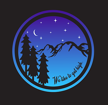
Customized Vinyl Decal
This decal was requested by someone who loves the great outdoors and wanted something uniquely designed for them. With spruce-style trees, illustrative mountain peaks, a bright moon, and floating stars, the gradiated purple to blue color resembles a beautiful night sky.

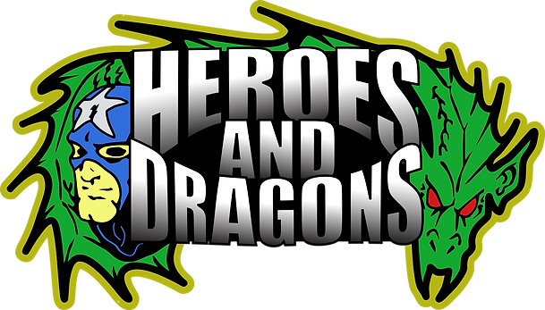
Comic Book Store Logo Revamp
A comic book store owner needed a modernized refresh of the logo they had hand-drawn when the shop first opened years ago. The original file had been scanned in, leaving the colors washed out and overly bright, so the palette was deepened to feel more true-to-life while staying recognizable. A black-to-white gradient was added to the store name, giving it more depth and a polished, contemporary finish, all while honoring the personality of the original design and ensuring customers trust the familiarity.


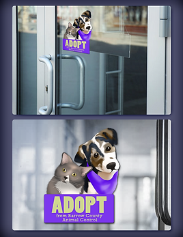
Animal Shelter Fundraiser Window Cling
This project started not with a client brief, but with grief. When a county shelter euthanized a dog who had a rescue commitment, the community responded with heartbreak and outrage, and I responded by drawing a portrait of her and sending it to the volunteer group. The portrait inspired the volunteers to hold a fundraiser by selling window clings to fund vaccinations for animals in the shelter's care. They understandably felt a fresh image would better unite the community around hope rather than loss, and I created an original illustration of a dog and cat to pair with their message. The clings sold beyond expectations, raising enough to fund vaccines for every puppy and kitten the shelter took in that year.
Business Location Mascot
A company sought a mascot for their building and held a contest to find the best one. I knew the company culture celebrated local heritage for each building they had, and even named their office spaces after rivers in the area. Since they are located in Columbia, I chose imagery that speaks to the Congaree river which runs under the Gervais Street bridge, a historic and well-known bridge in the city. Along this river, locals can often spot Yellow-Bellied Slider turtles. I kept a 4-color palette using the company's blue and orange tones alongside black and white to make a recognizable, bold mascot-esque design overlain on the state of South Carolina.
Ultimately, I did not win the contest, but it was still a fun design to work on, especially with such a limited color palette.

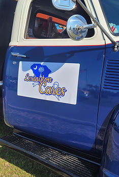
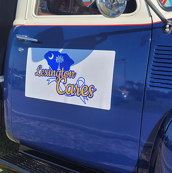
Community Outreach Group Signage
When a local community outreach group joined a parade just days before the event, they were prepared to march behind hand-written posters. I stepped in because I wanted them to make a real impression because these were people doing meaningful work for their community and they deserved to look the part. Working without an existing logo, I built their visual identity from scratch: the state silhouette and iconic palmetto tree as a grounding symbol of local pride, paired with an awareness ribbon to reflect their mission, and their name set in a warm, readable script. I anchored everything in blue and yellow, the town's high school colors, so locals would feel an immediate sense of familiarity. I produced the final design as a magnet layered with vinyl for a clean, professional finish. For something built in days from nothing, it looked like it had always existed.

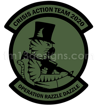
U.S. Army Team Patch
When a contact serving in the US Army reached out to design a patch for their newly formed Crisis Action Team, the concept practically wrote itself: their team was called CAT, so naturally, the mascot had to be a cat. I illustrated the character in the bold, graphic style of standard issue patches, with the team's lettering set in a font that mimics regulation military type, so it would feel at home alongside any patch already on the uniform. The mask on the character is a detail that works on two levels: a nod to the defining reality of 2020, and a direct reflection of the team's mission distributing aid supplies. I kept the palette to regulation army green and black, respecting the visual language of military culture while letting the illustrated character bring personality and unit pride. The team loved it, and there's something special about knowing a design you created is worn on the uniforms of brave souls serving the country.

Personnel Services Postcard
Designing this postcard meant speaking to three distinct audiences in a single glance. Working within the agency's established brand colors, I focused on creating a sophisticated layout that felt professional enough to reflect the company's credibility while remaining approachable to job seekers. I curated three stock images: a warehouse worker in hi-vis gear, a collaborative office meeting, and an administrative professional on a phone call. Each viewer immediately sees themselves represented. In a format where you have seconds to make an impression, making the audience feel seen is critical.


Realtor Business Card
Realtor branding comes with strict guidelines, so the creative challenge here was finding distinction within structure. Working with the provided logo and the client's professional photo, I focused on visual hierarchy to ensure her contact and credential information was scannable at a glance because a business card in a competitive market has one job: be remembered and be useful. The layout balances professionalism with personality, letting her photo build the personal connection that real estate runs on.


Insurance Agent Digital Advertisement
An insurance agent needed a digital ad slide designed for display on an office TV. The agent's photo was kept large and central, pairing a friendly, approachable face with a bold main message so the meaning registers at a glance from across a room. Required company information were incorporated to standard, keeping the design compliant without cluttering the layout.

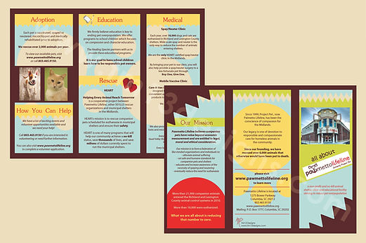
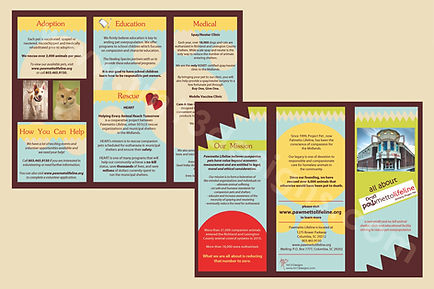
Animal Rescue Brochure
A local animal rescue needed new, fresh marketing materials to educate the public on their offerings, especially on available education and medical services. Brochures are a great way for the community to have a lot of info in a small, easily digestible package. Using a calming light blue and yellow palette underneath, the details are layered thoughtfully across the panels. Green and red are used to highlight main details about the facility and their mission, and the whole thing is outlined in a rich brown so each panel keeps the readers focus, instead of meshing too much information together. This design also works well in grayscale, which helps save the rescue money on printing.
Gym Promotional Flyer
This gym flyer had a lot of ground to cover: current deals, environment descriptors, and service offerings all competing for space on a single page. Working within their brand colors of red, yellow, and white, I chose a dark grunge-textured background to give the design an energetic, no-nonsense edge that matches the intensity of a gym environment. The contrast lets their bold colors jump off the page without feeling chaotic. Text hierarchy drove every layout decision with their promotional deals in the largest type, drawing the eye immediately, while supporting details are layered in a way that guides the reader naturally without overwhelming them.

You need design in your life.
Choose TM13 Designs
for your design needs.
 Personalized Ornament | 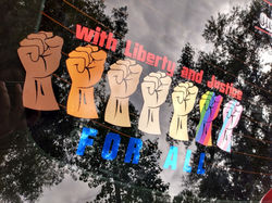 Human Rights Decal | 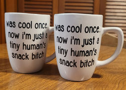 Decals for Mugs |
|---|---|---|
 Ride-Along Buddy Decal |  Graffiti Style Decal | 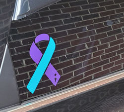 Special Edition Decal |
 Driver Decals |  Uniquely Designed Decals | 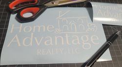 Signage Decals |
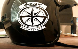 Riding Gear Decals |  Pet Silhouette Decals |  Tumbler Decals |
 Resin Jewelry Tray |  Resin Jewelry Box | 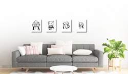 Printed Pet Portraits |
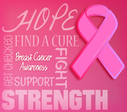 Social Media Graphic | 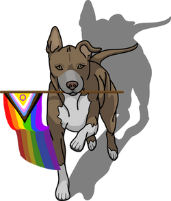 Illustration |  T-Shirt Design |
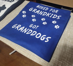 Screenprinted Tee |  Screenprinted Tee |  Screenprinted Uniform |
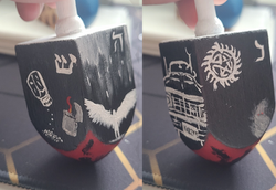 Hand-Painted Dreidel |